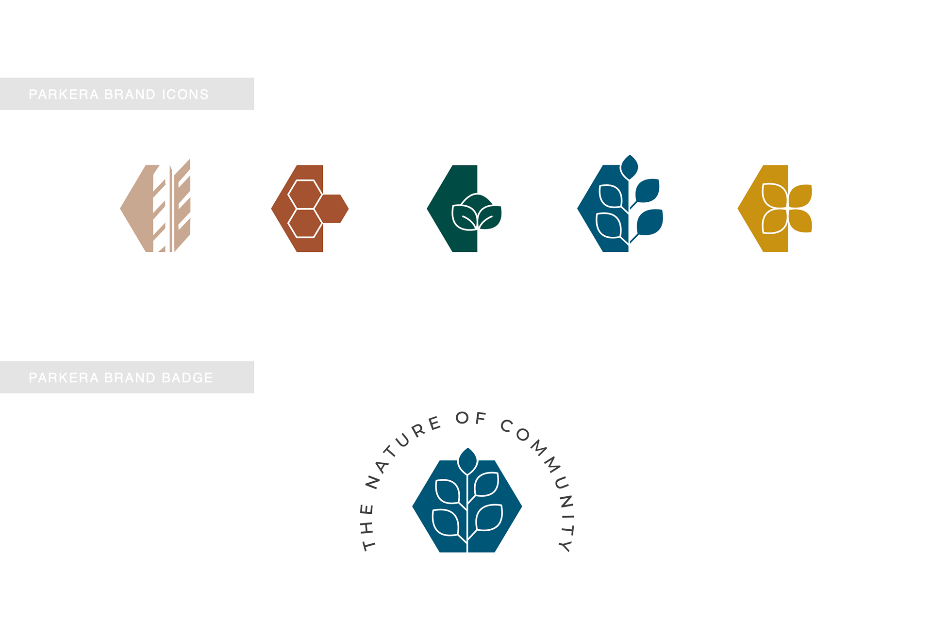
The design of Parkera’s brand and logo is deeply rooted in the company’s mission to integrate nature into community development, fostering both environmental harmony and social connection. The creative process was guided by the following key principles:
Nature-Centric Aesthetic
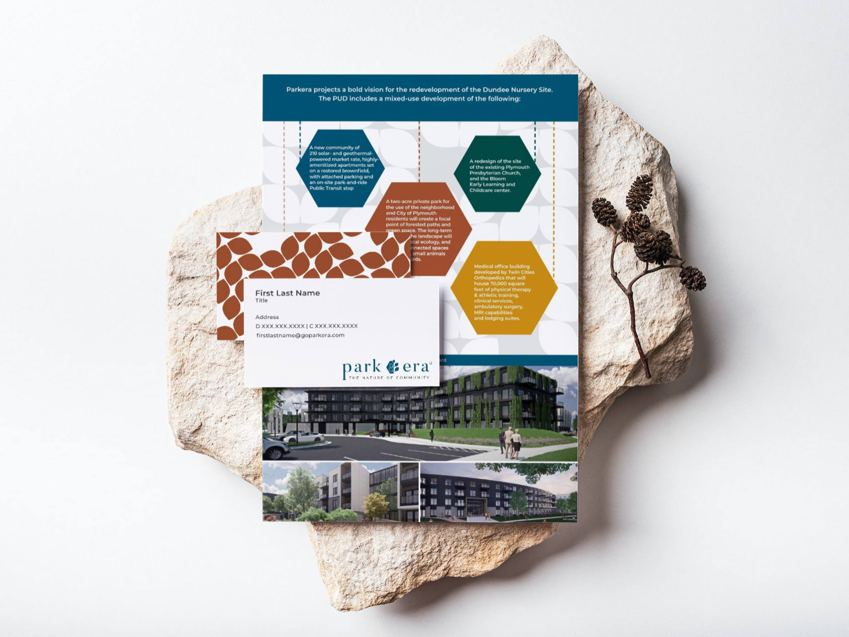
Parkera’s identity is built on the philosophy that we should exist as part of nature, not apart from it. This core belief influenced every aspect of the design, from the choice of colors to the typography and visual elements. Organic shapes, earthy tones, and natural textures were incorporated to reflect this commitment to biophilic design.
Symbolism in Design Elements
The logo incorporates elements that symbolize unity, growth, and sustainability. Whether through abstract representations of trees, leaves, or flowing landscapes, each detail reinforces Parkera’s dedication to creating spaces where people and nature thrive together.
Color Palette & Typography
A carefully selected color palette—likely inspired by natural hues such as greens, browns, and earth tones—was chosen to evoke feelings of tranquility, balance, and renewal. The typography complements this vision by maintaining a modern yet organic feel, ensuring readability while conveying warmth and approachability.
Emotional & Psychological Impact
Studies show that nature-inspired design positively influences mental and physical well-being. By infusing Parkera’s branding with these principles, the logo aims to elicit a sense of belonging, calm, and inspiration, encouraging people to engage with the brand’s vision for healthier, more connected communities.
Audience-Centered Approach
Parkera’s target audience—homeowners, developers, and communities looking for sustainable and thoughtfully designed living spaces—played a key role in shaping the brand identity. The design choices were made to resonate with those who value environmental responsibility, wellness, and modern yet timeless aesthetics.
Conclusion
Parkera’s brand and logo are more than just visual elements—they are a direct reflection of the company’s purpose. By intertwining nature, community, and sustainability into its design, the brand establishes a clear and compelling identity that aligns with its mission to create stronger, more connected neighborhoods through nature-centric living.

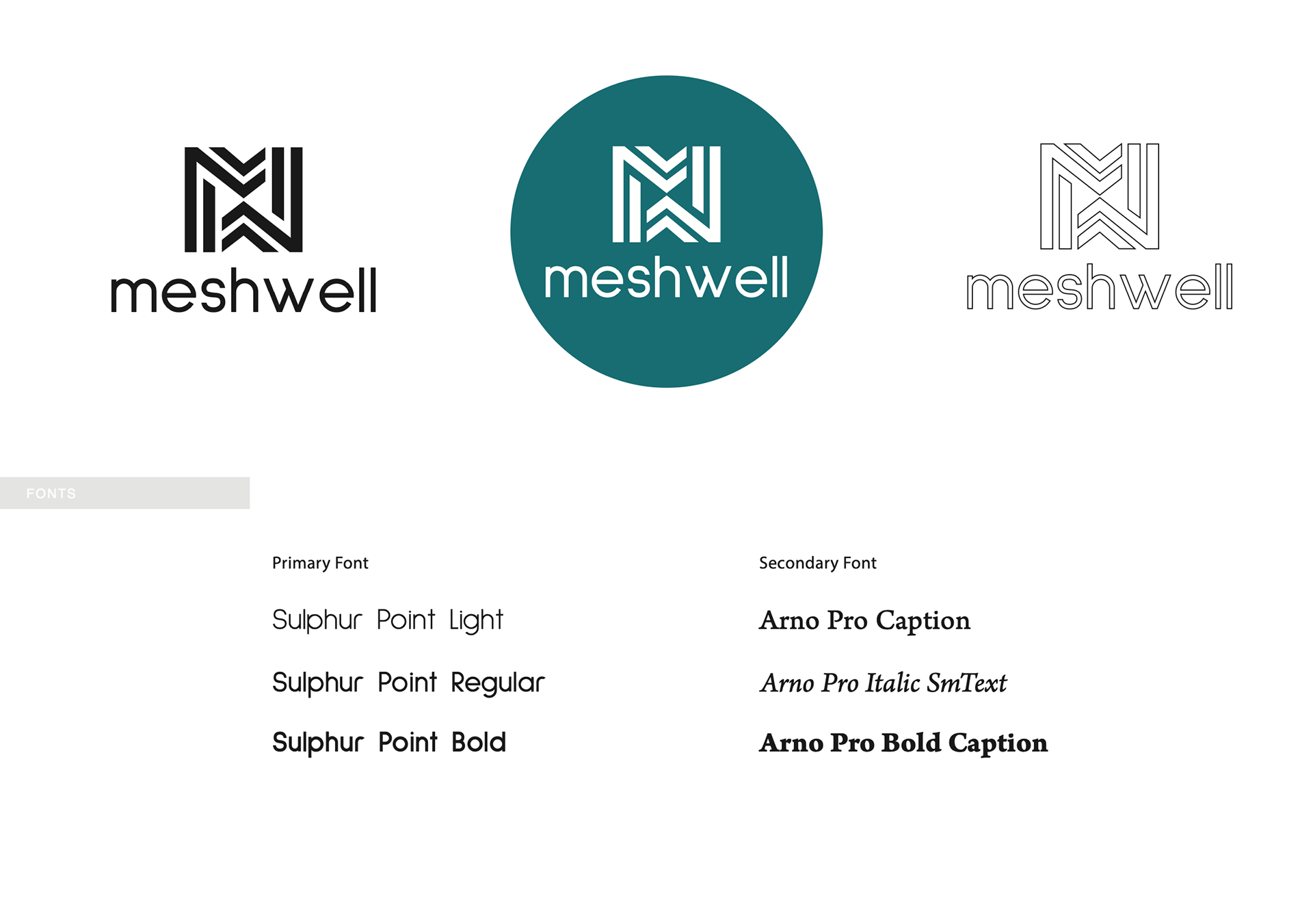
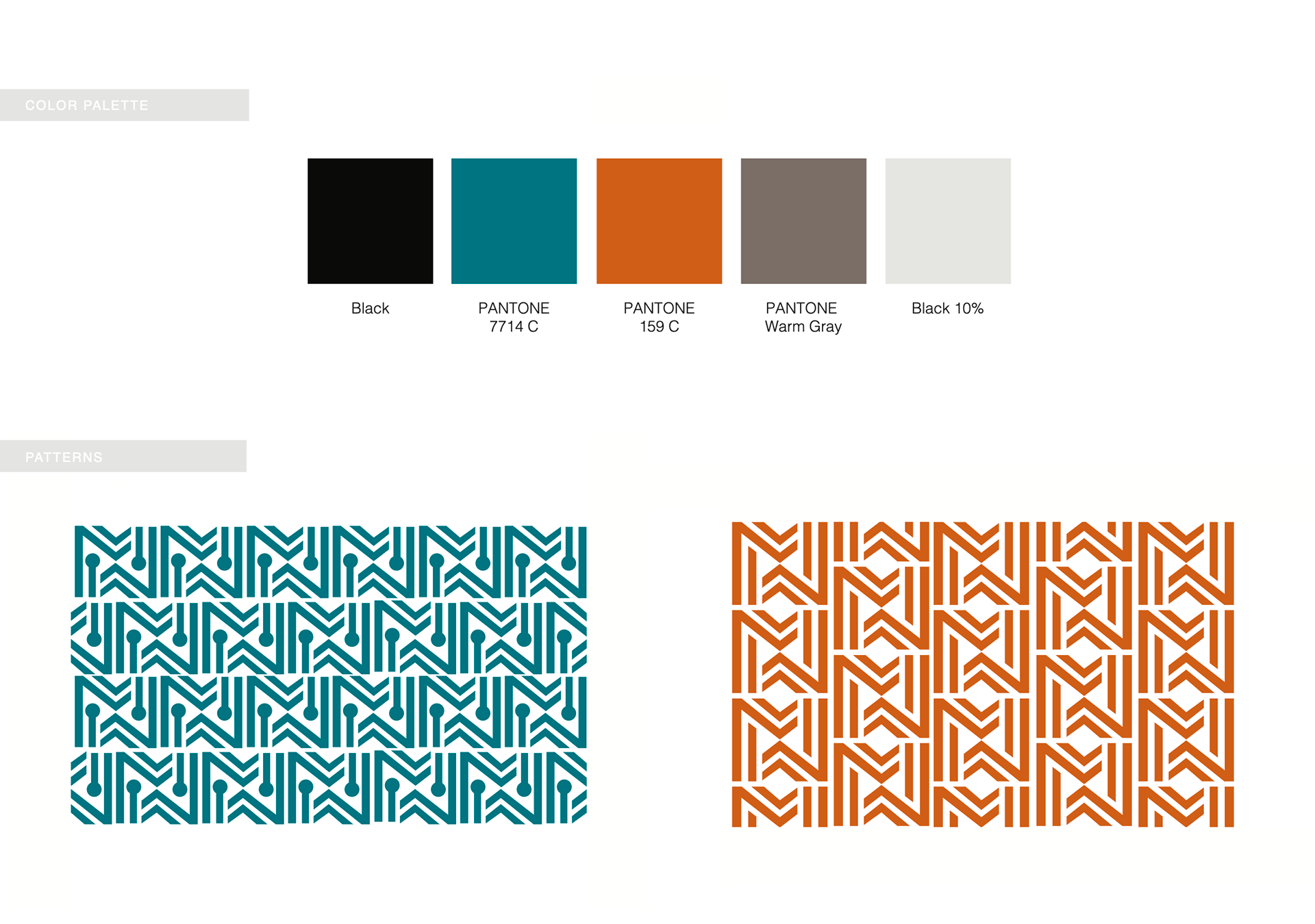
The Meshwell brand identity was meticulously crafted to visually embody its mission: seamlessly integrating advanced talent assessment technology with human expertise. The design strategy centers around precision, connectivity, and forward-thinking innovation, ensuring that the brand resonates with both corporate leaders and employees.
Concept of Connectivity & Harmony
At its core, Meshwell represents the interwoven relationship between technology, data, and human potential. The "M" icon in the logo, composed of interlacing geometric lines, symbolizes structured alignment—echoing the company’s ability to bring together the right people and opportunities. The use of symmetry and repetition visually reinforces stability, trust, and balance, key qualities in effective talent management.
Modern, Tech-Forward Aesthetic
Given Meshwell’s foundation in cutting-edge assessment technology, the logo and overall brand identity adopt a sleek, contemporary look. The clean, sans-serif typography of Sulphur Point conveys clarity and modernity, ensuring an easy-to-read and approachable feel while maintaining a sense of professionalism.
Symbolism in Design Elements
The geometric patterns derived from the logo reflect precision and predictability, much like the company’s data-driven insights.
The structured lines within the icon symbolize order, direction, and progress, reinforcing Meshwell’s commitment to helping businesses make smarter hiring and talent decisions.
The circular variations of the logo mark emphasize wholeness and inclusivity, aligning with the company's goal of fostering engaged, successful employees.
Color Palette & Psychology
Meshwell’s color scheme was selected to evoke trust, innovation, and sophistication:
Teal (Pantone 7714 C): Represents intelligence, technology, and strategic thinking—core principles of the brand.
Orange (Pantone 159 C): Adds warmth and energy, reflecting the human-centered approach behind the technology.
Black & Warm Gray: Provide a foundation of professionalism, reliability, and timelessness.
White/Light Gray Accents: Keep the brand feeling fresh, clean, and modern.
This balanced palette ensures Meshwell appears both cutting-edge and approachable, appealing to corporate professionals and HR leaders alike.
Emotional & Psychological Impact
The structured yet dynamic logo conveys a sense of trust and forward movement, reinforcing Meshwell’s role in helping companies build high-performing, engaged workforces. The sharp angles and clean typography instill confidence, while the warm color accents add a personal, human touch. The result is a brand identity that feels both precise and people-centric.
Audience-Centered Approach
Meshwell’s brand is designed to appeal to business leaders, HR professionals, and organizations that value data-driven decision-making. The modern, structured design communicates competence and innovation, ensuring Meshwell is seen as a trusted, sophisticated solution in the competitive talent management space.
Conclusion
Meshwell’s branding is a visual representation of its mission—blending advanced assessment technology with human expertise to create better workplace connections. The combination of geometric precision, modern typography, and a balanced color palette reinforces trust, innovation, and reliability, ensuring that the brand stands out as a leader in predictive talent assessment.
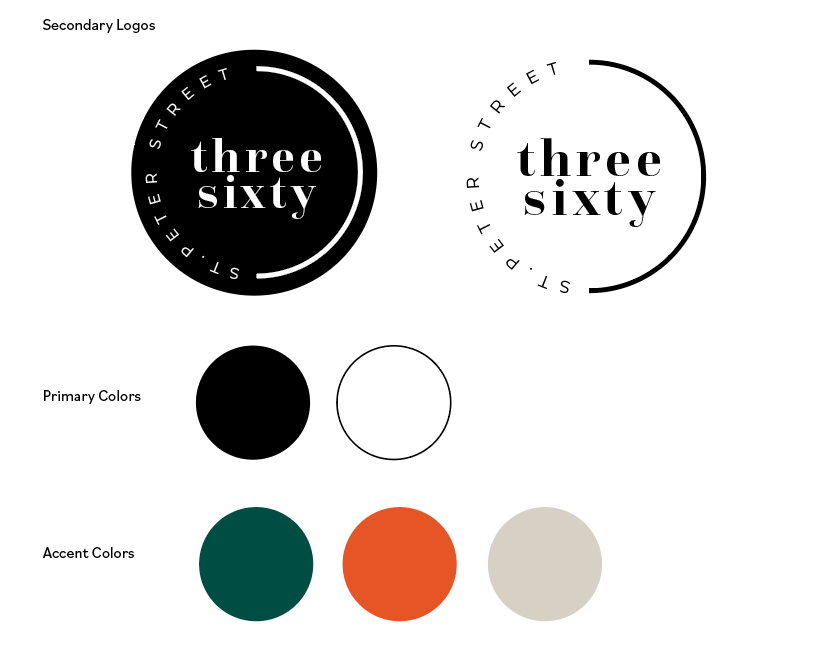
The branding and logo design for Three Sixty St. Peter Street were developed to encapsulate the essence of elegance, versatility, and a seamless event experience. The creative direction was shaped by the venue’s unique attributes—its panoramic views, modern sophistication, and its ability to host a variety of gatherings with style and ease.
Concept of "Three Sixty"
The name itself, Three Sixty, suggests a full-circle experience—an all-encompassing, immersive event space where guests are surrounded by stunning city views and refined ambiance. This idea played a crucial role in the logo design, influencing the use of circular or fluid elements that represent completeness, continuity, and seamless transitions between different event styles.
Sophisticated & Timeless Aesthetic
The brand needed to exude luxury while maintaining a welcoming and adaptable feel. This was achieved through a minimalist yet refined design approach—favoring clean lines, balanced compositions, and a polished aesthetic that speaks to high-end clientele without feeling overly ornate.
Symbolism in Design Elements
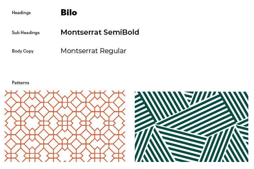
The logo and branding subtly reference the panoramic experience of the venue. Whether through circular motifs, geometric balance, or spatial openness in the typography, the design reinforces the idea of an expansive, all-encompassing event space. The typeface was carefully chosen to embody sophistication and modernity while maintaining readability and a sense of exclusivity.
Color Palette & Typography
A carefully curated color palette—likely featuring neutral, metallic, or deep, rich tones—was selected to reflect elegance, professionalism, and adaptability. These tones allow the brand to seamlessly blend with different event themes while maintaining its own distinct identity. The typography mirrors this sophistication, striking a balance between contemporary and classic styles to ensure timeless appeal.
Emotional & Experiential Connection
The branding was designed to evoke anticipation, celebration, and exclusivity. Whether for weddings, corporate events, or private gatherings, the visual identity aims to assure clients that Three Sixty St. Peter Street is the ultimate backdrop for unforgettable moments. The design choices create a sense of trust and aspiration, aligning with the high expectations of its clientele.
Audience-Centered Approach
Three Sixty St. Peter Street caters to event planners, couples, corporations, and individuals seeking a premium venue. The branding was developed with this audience in mind, ensuring that every element—from the logo to the website and marketing materials—feels elevated, refined, and aligned with the luxurious experience the venue offers.
Conclusion
The Three Sixty St. Peter Street brand and logo were thoughtfully crafted to capture the essence of sophistication, panoramic beauty, and seamless event experiences. By combining elegance with versatility, the visual identity reflects the venue’s commitment to creating extraordinary, full-circle moments in an unforgettable setting.

The branding and logo design for NOPO on 21st were created to reflect the restaurant’s mission of discovery, community, and an elevated yet approachable dining experience. The design approach was shaped by NOPO’s commitment to expanding culinary horizons while maintaining a welcoming, home-like atmosphere.
Concept of Exploration & Discovery
NOPO’s brand promise centers on curating new and exciting food and beverage experiences for its guests. This sense of discovery is visually represented in the logo’s dynamic typography, organic design elements, and modern styling. The name itself, “NOPO,” conveys a sense of location and identity, making the brand feel distinct and memorable.
Approachable Sophistication
The brand aims to balance sophistication with warmth—offering an upscale experience that remains inviting and unpretentious. This balance is reflected in the logo’s typography, which combines bold and fluid elements to create a look that is both refined and welcoming. The choice of a handwritten or script-style element adds personality, while the strong serif or sans-serif components reinforce stability and modernity.
Symbolism in Design Elements
The use of a leaf motif in the logo symbolizes freshness, growth, and a connection to nature—reinforcing the idea that NOPO is always bringing something new and exciting to the table. The curved, organic feel of the leaf contrasts with the structured typography, mirroring the restaurant’s ability to provide an elevated experience without feeling rigid or formal.
Color Palette & Typography
The color palette, which incorporates earthy, warm tones, speaks to the restaurant’s focus on natural ingredients, seasonal offerings, and a welcoming atmosphere. The typography choice is modern yet timeless, ensuring that the brand remains fresh and relevant while still feeling established and trustworthy. The slight playfulness in the font choice also ties into the brand’s promise of discovery and interaction.
Emotional & Psychological Impact
The brand identity was designed to create a sense of comfort, curiosity, and community. The logo’s handcrafted elements make it feel personal and inviting, while the structured components add a level of polish that reassures guests of a high-quality experience. The overall design fosters a sense of belonging, making guests feel as if they’re stepping into an extension of their own home.
Audience-Centered Approach
NOPO’s target audience includes food enthusiasts, locals looking for an elevated experience, and visitors seeking a unique yet approachable dining atmosphere. The branding was crafted to appeal to those who enjoy a big-city culinary experience in a small-town setting, blending contemporary aesthetics with warmth and familiarity.
Conclusion
NOPO’s brand and logo are a visual representation of its commitment to exploration, hospitality, and culinary excellence. By incorporating elements of discovery, warmth, and sophistication, the design ensures that NOPO stands out as a restaurant that delivers both unexpected flavors and a familiar, welcoming experience.
